 |
| Taking art direction to another level. |
Okami (2006)
 |
Beautiful is an understatement to
describe the art of Okami.
|
The Legend of Zelda: The Wind Waker (2003)
 |
The HD treatment certainly gave Wind Waker
a significant boost, visually.
|
This list wouldn't have been complete without mention of the GameCube classic, The Legend of Zelda: The Wind Waker. Wind Waker was originally shunned by fans for its childish look after witnessing the more "realistic" E3 tech demo. However, Wind Waker has aged gracefully over the years due its colorful visuals and found a soft spot with the fans. The sea-based adventure remains memorable and engaging as it was years ago. It was made even better with the 2013 Wii U remaster, which added additional vibrancy to an otherwise great looking game.
Killer7 (2005)
 |
| Killer looks. |
Killer7 is often considered to be developer Suda51's best work. A gripping narrative with a macabre twist and on-rails hybrid first and third-person views made it a stand out game of the stellar library of 2005. One of Killer7's notable aspects was its use of cel-shading. While it hasn't aged as gracefully by today's standards, most of Suda's works don't do anyway, it's dark use of cel-shading complimented the dark atmosphere it was striving for and as a result worked well. A modern-day remaster would definitely help smooth out some of the game's rough edges.
Guilty Gear Xrd -SIGN- (2014)
 |
| Guilty Gear Xrd is bursting with style all-over. |
Jet Set Radio (2000)
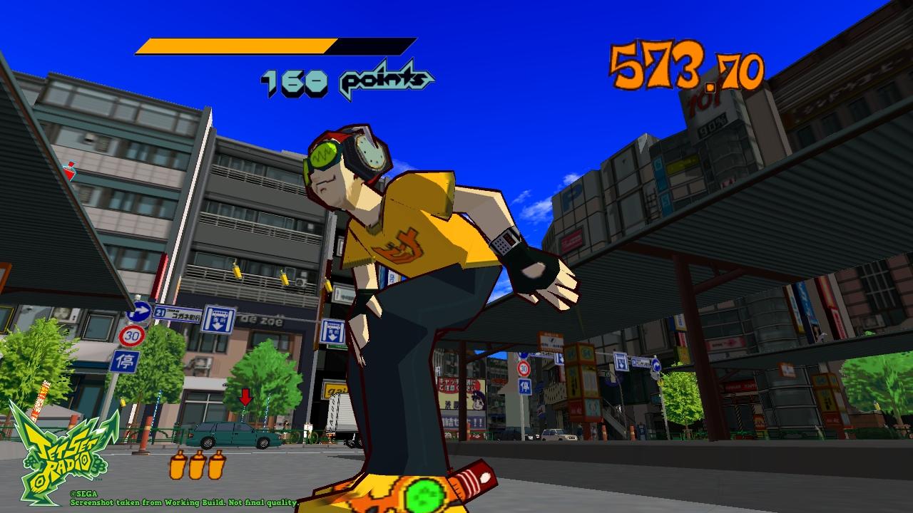 |
| Paint the town red. |
MadWorld (2009)
 |
| Black, white, and a whole lot of red! |
Yet another cult classic, the ultraviolent MadWorld came as a surprise not due to its violent nature, but for the fact that it was released on Nintendo's family-friendly home console, the Nintendo Wii. Created by the staff of the defunct Clover Studio now called Platinum Games, MadWorld has players navigating through a broody premise with black and white cel-shaded visuals and a whole lot of blood. While the Wii was known to be graphically inferior compared to the Xbox 360 and PS3, MadWorld's blend of Sin City-inspired atmosphere and well-crafted cel-shaded visuals, helped it stand out against the competition and proved that sometimes a realized art-style can overcome raw graphical prowess.
Sly 2: Band of Thieves (2004)
 |
| The gang's still looking good. |
Before their work on the popular Infamous series, developer Sucker Punch was responsible for creating a stealth-based platformer series known as Sly Cooper. While the first game was great in its own right, it was Sly 2: Band of Thieves that excelled both mechanically and visually. Not only it had some of the best levels and pacing in the series but it boasted some charming cel-shaded visuals with a "Saturday-morning cartoon" feel. Sly 2 was one of the PS2's stylish games, for good reason.
Valkyria Chronicles (2008)
 |
| Sega's visually stylistic game yet. |
Valkyria Chronicles was a role-playing game with heavy influences on strategy. It was also one of those underappreciated gems of the PS3 days. Utilizing Sega's then-hyped CANVAS engine, Valkyria Chronicles delivered sharp, clean cel-shaded visuals on the PS3. The character models and environments designs were stunning and remain stunning some 10 years later, they've also looked sharper than ever thanks to the enhanced remaster released years ago.
Tales of Symphonia (2003)
 |
| One of the purple box's impressive titles. |
The GameCube was home to classic JRPGs, one of them was none other than 2003's Tales of Symphonia. Packing a memorable cast and solid faced-paced gameplay, it remains a beloved titled with fans and a popular pick for newcomers as well. As with many Tales games, Symphonia featured colorful cel-shaded graphics alongside its deformed "chibi" character models that remain some of the best the GameCube had to offer, despite its limited graphical power. Symphonia's visuals carries a certain nostalgic charm to them, even if they've aged a bit.
Persona 5 (2017)
 |
| Atlus hits another stylish home run with Persona 5. |
A more recent entry on the list, developer Atlus' Persona 5 takes cel-shading to another level with its stylistic use of the technique. Taking queues from previous Persona games and 2011's Catherine, the team did a commendable job of handling the lighting, modeling, and shading of the characters and environments. It makes the player feel like they're playing an anime series, if that makes any sense. Persona 5's artistic choice of blending a cel-shaded anime art-style with the picaresque premise gives it a unique presence in a year filled with many visually captivating titles.
Comments
Post a Comment